Lab results dashboard

Lab results dashboard

Lab results dashboard

Jan 29, 2026

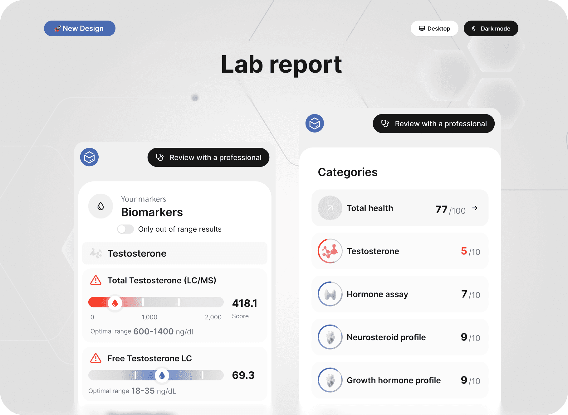
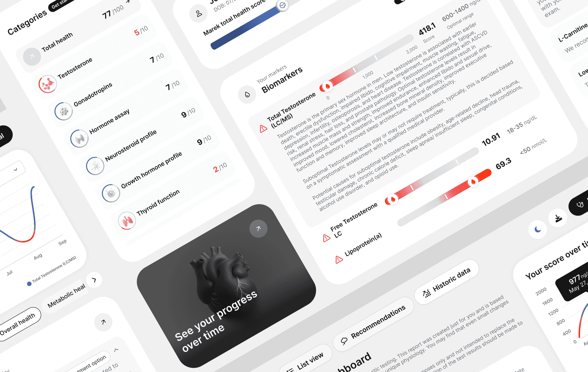
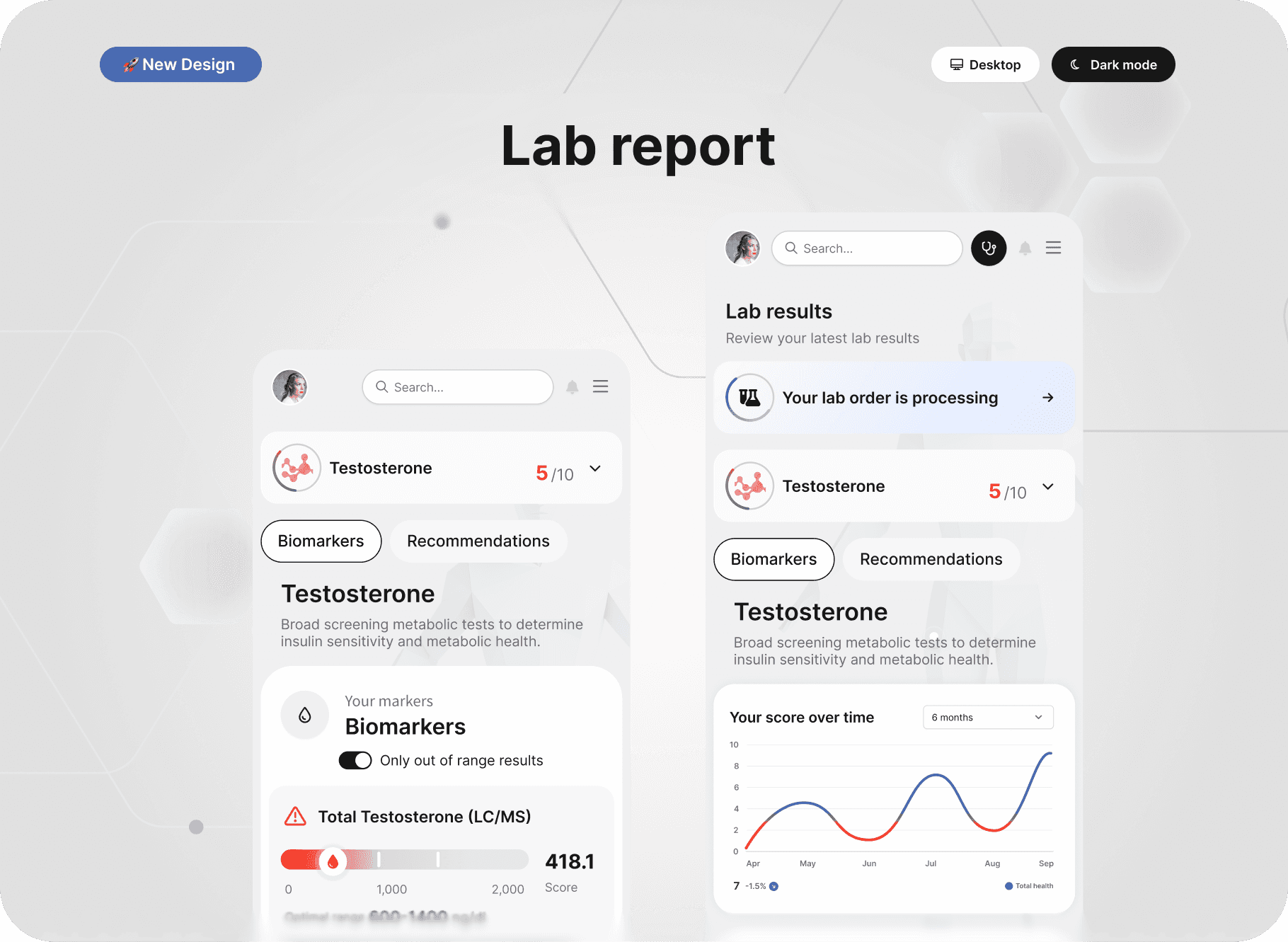
A comprehensive lab results dashboard designed to help users interpret complex biomarker data with clarity and confidence. The system organizes laboratory results into structured health categories, highlights out-of-range markers, and surfaces personalized recommendations — transforming static reports into an interactive health intelligence platform.

Scope: Product UX, data visualization, information architecture, system design
Platform: Responsive web + mobile experience

0M+

users reached

0+

months of collaboration

7000+

hours of time saved

The process

Traditional lab reports are dense, technical, and difficult for non-clinicians to interpret. Users often struggle to:

  • Understand what results mean

  • Identify priority markers

  • See trends over time

  • Know what actions to take

The challenge was to reduce cognitive overload while preserving medical accuracy and clinical credibility.

01

Discovery

/research and insights

Analyzed how users interpret lab reports, where confusion occurs, and how prioritization could be made clearer through structured categorization.

01

Discovery

/research and insights

Analyzed how users interpret lab reports, where confusion occurs, and how prioritization could be made clearer through structured categorization.

01

Discovery

/research and insights

Analyzed how users interpret lab reports, where confusion occurs, and how prioritization could be made clearer through structured categorization.

02

Design

/concepts and execution

Developed a modular system for biomarker presentation, including scoring models, visual sliders, radar graphs, and contextual explanations.

02

Design

/concepts and execution

Developed a modular system for biomarker presentation, including scoring models, visual sliders, radar graphs, and contextual explanations.

02

Design

/concepts and execution

Developed a modular system for biomarker presentation, including scoring models, visual sliders, radar graphs, and contextual explanations.

03

Testing & Iteration

/feedback and refinement

Iterated on alert states, color use, density, and microcopy to ensure users could distinguish urgency without feeling overwhelmed.

03

Testing & Iteration

/feedback and refinement

Iterated on alert states, color use, density, and microcopy to ensure users could distinguish urgency without feeling overwhelmed.

03

Testing & Iteration

/feedback and refinement

Iterated on alert states, color use, density, and microcopy to ensure users could distinguish urgency without feeling overwhelmed.

04

Delivery

/handoff and launch

Delivered a scalable dashboard experience optimized for both desktop and mobile, ensuring accessibility and consistency across health categories.

04

Delivery

/handoff and launch

Delivered a scalable dashboard experience optimized for both desktop and mobile, ensuring accessibility and consistency across health categories.

04

Delivery

/handoff and launch

Delivered a scalable dashboard experience optimized for both desktop and mobile, ensuring accessibility and consistency across health categories.

05

Scaling

/growth optimization

Designed the system to support expanding biomarker panels, new recommendation types, and longitudinal health tracking without disrupting structural clarity.

05

Scaling

/growth optimization

Designed the system to support expanding biomarker panels, new recommendation types, and longitudinal health tracking without disrupting structural clarity.

05

Scaling

/growth optimization

Designed the system to support expanding biomarker panels, new recommendation types, and longitudinal health tracking without disrupting structural clarity.

Performance at scale

Satisfaction

Score

87%
37+

Countries

37+

Countries

37+

Countries

0K+

Views

0K+

Views

0K+

Views

0+

Languages

0+

Languages

0+

Languages

17M+

Active users

2021

2022

2023

2024

2025